From an aesthetic point of view, the carving of a seal basically involves the art of lines and how they can be combined to produce harmony within a defined space.
Any one engraving generally includes both thick and thin lines. The traditional technical terms used to describe these lines are highly poetical such as, for example, "spider's web" or "mosquito leg" for very thin lines, "buffalo energy" to suggest the width or force of a thicker line.
As for the actual shapes of the lines and the directions in which they move, they can be straight or curved, continuous or broken, light or heavy. In fact, there are limitless possibilities for weaving lines together to produce the final effect. Individually, each line conveys its own message and yet it has a vital role to play in contributing to the overall calm, silence, delicacy, life and energy of the seal.
In comparison with Western Art, the Chinese emphasise the importance of the line and how it is drawn, usually by following one of the fundamental approaches of Chinese art -chiaroscuro, the contrast between light and shade.
"A good calligrapher writes with his bones".' This saying expresses in a nutshell an essential principle of Chinese calligraphy - that is, the good calligrapher must draw out his characters with both energy and confidence. Shaky writing is the sure sign of an incompetent calligrapher and these characters are said to be written with the flesh, not bones!
Here we can draw a comparison with painting: an artist can convey sky or mountains by tracing a single horizontal line with variable shading suggestive of a rolling surface or clouds. The true artist achieves this through perfect control of the different shades of ink and by combining heavier inks with lighter ones.
This particular example also demonstrates an aesthetic principle related to the horizontal line (described as "yin" because of the connotations of lightness, passivity and so on). The horizontal line, the veritcal line and the dot are the three basic movements in all writing and calligraphy.
Another saying is related to the form of vertical lines: "Vertical lines are like the roots of an ancient tree". This means that the artist should take his inspiration from the roots of an old creeper when he draws vertical lines so that he can communicate their energy to the observer.
In turn, dots should be placed "like a stone on a mountain-top", conveying a stable energy, solidity and support just like the stone which rests at the peak of the mountain.
To achieve a fluid script, the calligrapher must be experienced in applying the brush confidently.
When drawing a horizontal line, the average engraver uses the same pressure throughout after an initial burst of energy. This is not the case with the experienced artist. From the very beginning of the stroke, the experienced artist gives each movement of the line a carefully measured amount of contained energy with controlled spontaneity as if something were holding him in, a barrier which breaks the initial impetus of each movement. This is how he can transmit the desired heightened intensity and deeper emotional charge.
Another interesting point which should be noted is the difference in the principles underlying the concept of the line in Western and Chinese Art. Although I run the risk of oversimplification, in order to better understand the spirit of Chinese Art we can compare the two artistic styles in terms of fighting. Western Art is forceful, aggressive like boxing, an opposition of two equal forces placed in confrontation against each other in a fight for or within a limited space. Chinese Art, on the other hand, is like Kung Fu where avoidance of direct confrontation is the rule of the day. There is a sideways approach with a more balanced, contained opposition resulting in a more gentle effect whose peaceful, internal equilibrium is of prime importance.
There must be an attempt to give each item its own space and from there work towards a general impression of tranquillity.
There are two basic elements involved in carving a seal: calligraphy and carving.
At first, written characters possessed only an ideographical value for communicating messages and ideas, they were no more than functional indicators. They developed into aesthetic objects of art at a later date. During their first phase of development, the lines of the ideograms did no more than follow directly the outline of the concrete object which they were intended to represent.
Later on, different methods for producing the pictograms were created and history has categorized these into styles or schools of calligraphy. Accordingly, there are six main styles in the development of Chinese writing: the ancient or primitive style, Li Shu (Official Script) (隸書), Cao Shu (Grass Script) (草書). Kai Shu (Regular Script) (眞書), Xing Shu (Running Script) (行書) and Zhuan Shu (Seal Script) (篆書). Usually, Zhuan Shu characters are used for carving seals while the other kinds are only used very occasionally such as during the Qing Dynasty when eight different kinds of characters were used for seals.
It is important not to confuse Zhuan Shu with the kind of script called Da Zhuan (大篆), the characters of which are also called Zhou. This is an old style dating from before the Qin Dynasty of which only two documents, a bell and a tripod exist.
Wong Guo Wei, the wise man, makes the following point in his study on characters in Chinese writing: "During the time of the wars with the Qin Kingdom this state used Zhou characters while the other states used other kinds of ancient writing."
This dates from the period before the political unification finally achieved by the twenty first Emperor of the Qin Shi Huang Kingdom which resulted in the standardisation of the various kinds of script into a new pattern.
The Interpretation of Texts and Characters records that: "At the time of the war against the Qin Kingdom, the seven kingdoms used different characters, but in the year following unification by Emperor Qin, Prime Minister Li requested that the characters be made uniform".
It was precisely after this reform that the new script became known as Qin Zhuan or Xiao Zhuan. This marked the beginning of a widespread unification of writing in China. Zhuan script came to be used by seal carvers as the lines were more suitable for engraving and thus better adapted to the differing requirements of this craft.
This is no more than a general outline of the history of Chinese writing. In addition to these two main styles there exists a variety of scripts such as Ke Fu (刻符), Chong (蟲), Mo Yin (摹印), Zhu Shu (署書), Shu Shu (殳書) and Li Shu (隸書).
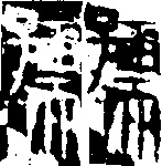
Kai Shu (Regular Script (眞書)
 1 - Inscription on Cuan Long Yan Monument (爨龍顏碑); Nan Pei Dynasty, Song State(宋 )420-479A. D..
2 - "Yi He Ming" (瘞鹤銘) - a famous inscription carved on the side of a precipice; Nan Pei Dynasty, Liang State (南北朝•
1 - Inscription on Cuan Long Yan Monument (爨龍顏碑); Nan Pei Dynasty, Song State(宋 )420-479A. D..
2 - "Yi He Ming" (瘞鹤銘) - a famous inscription carved on the side of a precipice; Nan Pei Dynasty, Liang State (南北朝• ), 502-557 A. D..
3 - Stone inscription of the poem "Lan Guan Shi Ji" (郎官石記) by Zhang Xu (張旭); Tang Dynasty (唐朝), 618-907 A. D..
), 502-557 A. D..
3 - Stone inscription of the poem "Lan Guan Shi Ji" (郎官石記) by Zhang Xu (張旭); Tang Dynasty (唐朝), 618-907 A. D..
Cao Shu (Grass Script) (草書 )
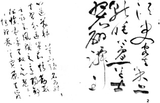 1 - Studies in Calligraphy (書譜) by Sun Guo Ting (孫過庭); Tang Dynasty (唐朝), 618-907 A. D..
2 - Famous engraving of a page of the "Hon Chi Bi Fu" (後赤壁賦) by Zhu Yun Ming (視允明); Ming Dynasty (明朝), 1368-1644 A. D..
1 - Studies in Calligraphy (書譜) by Sun Guo Ting (孫過庭); Tang Dynasty (唐朝), 618-907 A. D..
2 - Famous engraving of a page of the "Hon Chi Bi Fu" (後赤壁賦) by Zhu Yun Ming (視允明); Ming Dynasty (明朝), 1368-1644 A. D..
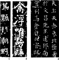
Xing Shu (Running Script) (行書)
1 - Example of calligraphy by the famous calligrapher Wang Xi Zhi(王羲之)of the poem "San Luan Tie" (喪亂帖); Jin Dynasty (晋朝) 265-420 A. D..
2 - "Shi Zuo" (詩作), a poem by Mi Fei (米芾); Song Dynasty (宋朝), 910-1279 A. D..
3 - Excerpt from the anthology of poems by Yung Wei Zhen (楊維楨); Yuan Dynasty, 1279-1368 A. D..
Jia Ku Wen Script (甲骨文)
Shang Dynasty ( 商朝), 1600?-1066 B. C..
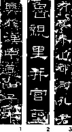
Zhuan Shu (Seal Script) (篆書)
1 - Characters by Yu Ding ( 盂鼎銘文 ), Xi Zhon Dynasty (西周), 1066-771 B. C..
2 - Characters engraved on a cylindrical stone, Dong Zhou Dynasty (東周), 770-221 B. C..
3 - Stone inscriptions on Tai Shan Mountain (泰山), Qin Dynasty (秦), 221-206 B. C..
We can conclude from this that the seal-carver is somebody with a great deal more knowledge than simply a grounding in writing. The seal-carver is really a scholar with an understanding of the various styles and schools of writing and how they have developed. He must have studied carefully the ancient characters engraved on metal and stone tablets such as the characters from the end of the Zhou period, the characters from the six kingdoms before the Qin unification, the ancient Zhuan and Li characters and the characters from the Han Dynasty.
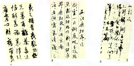
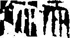
Li Shu Script(隸書)
1-"Shi Men Song". (石門頌), famed engraving on Shi Men Precipice. Dong Han Dynasty (東漢), 25-220 A. D..
2 - Inscription on the Li Qi Monument (禮器碑), Dong Han Dynasty (東漢), 25-220 A. D..
3 - Inscription on the Kong Zhon Monument (孔廟碑), Dong Han Dynasty (東漢), 25-220 A. D..
In general, seals were measured by the square cun (a cun was an ancient Chinese measurement equal to 3.3cm). Seals could vary in size from a maximum length of three cuns to a minimum measurement of a few fens (a fen is a tenth of a cun).
The seal is by its very nature a small item and so a great deal of technical and scholarly skill is required in engraving it. The myriad of styles which have appeared over the centuries, particularly from the Ming and Qing Dynasties on, must be assimilated by the engraver.
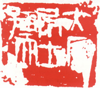
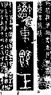
At the end of the Qing Dynasty, Yi Da An carved a seal with five characters. Yi Da An was one of the most famous seal-carvers. We shall look at his personal seal in order to reach a better understanding of the processes involved in producing a seal.
The seal exhibits a fine composition of lines creating an overall balance which is daring in its inventiveness and originality.
The layout and spacing of the characters is well-balanced, playing complex groupings of lines against simple ones.
The surface of the seal has been divided into six rectangles of equal size containing the five characters. Looking at them from right to left, each of the first four characters takes up one sixth of the space while the final character (on the left) occupies two sixths, that is two of the rectangles. Thus we can observe that each character virtually occupies its due space with four of the characters covering two thirds of the surface area while the final character covers one third. Looking at the seal from top to bottom, the ratio between occupied and empty space is the same, two to one. This gives the grouping of characters a general impression of balance and harmony.
The character  , is a simple character made up of broad, open lines. It has been flattened out to fill the space in the top right hand corner. The character ┌ is simpler and longer. It has been placed below the former and is almost like a right angle supporting the first character.
The two central characters, very regular in their shape, are contained within their spaces. They link and balance the characters on both sides. This is particularly noticeable in the lower character where the horizontal lines are carefully extended into a kind of buckle which joins together the vertical lines on each of the other characters.
The fifth character is a compound character. It is the most complex but also the one in which most imagination has been used to fit it onto the surface, occupying a whole third of the space on the left hand side.
The lines are dense and complicated, weaving together the three characters from which the compound is formed. The pictogram has, as it were, three bodies  . In order to engrave it, the seal-carver pushed up the character on the left
  , shortening the leg and joining the head onto the 雨 part. If the engraving had been left to a mere copier this leg would have come out as a symmetrical reflection of the leg on the character at the right hand side. As it is, however, the artist exploits fully the character 而which lends itself better to filling in the space by elongating the four vertical prongs. This composition gives the character breathing space by avoiding the heavy monotony of having five vertical lines concentrated into the same area.
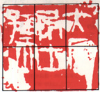
Yi Da An's Seal
The two characters 雨and 而 are very similar in appearance and each takes up the same amount of space, as the artist has balanced their proportions, coming up with a pleasant grouping of elements. The lower character is linked to the upper one by a belt (a horizontal line on top of the character). The fact that it veers upwards slightly also makes it more lively.
There are two other details which enrich the original flavour of this seal. The engraver has made the main veritcal lines of the character on the left lean very slightly in order to make the grouping lighter and to give it more energy.
By including empty space on the seal, the artist has freed the lower third of the surface and allowed it to support the part which is engraved. There are also four "holes" around the characters in the upper part.
These openings between the characters were intentional, not to give the seal the appearance of being "used" or "old" but rather to include some of the values which were being absorbed into, and thus enriching, China's aesthetic heritage over the centuries.
In this particular case, these "natural" additions can be seen on inscriptions on tombs, decorative tiles, panels or friezes in glazed porcelain, engravings or relief. Over a period of time, natural elements "sculpted" these grotesque disfigurements which were eventually included by artists in their work.
This seal is a perfect example of originality, balance, stability and vivacity with a magical feel to it and an energy which does not disturb in any way the serene mood of the contents.
The great craftsman Yi Da An looked to the most ancient traditions of his country and absorbed the various influences of and contributions by engravers and artists before following his own particular path.
Translated from the Portuguese by Marie Imelda Macleod
start p. 97
end p.